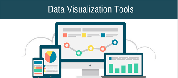
Data visualization is a graphical representation of information and data. This helps business view performance insight at a glance.
The graphical display can be inform of line graphs, pie-charts, bar graph, scatter plots among others. For small business, Data Visualization software plays a critical role in enhancing business performance metrics.
Through Data visualization software small business ,users can see and understand their trends and patterns.
With the use of Artificial intelligence development tools, this software are able to develop dashboard, machine learning and artificial intelligence that generate insights, forecast and many more just by a click of the button.Some have data automation capabilities where any data source can be accessed and data gathered for specific purposes.
We have researched and analyze the best Data Visualization software for small business as follows;
1.Microstrategy.
A data analytics tool called MicroStrategy provides businesses of all sizes with useful intelligence.
Users can create bespoke real-time dashboards and customize data representations. To provide people complete control over their findings, it makes use of data connectivity, machine learning, and mobile access.
It stands out as a leader in the enterprise analytics space because of its usability and scalability. Depending on their needs, users can pick a hybrid, cloud, or on-premise deployment.
Features of MicroStrategy.
1.Data Connectivity: Connect to over one hundred databases, including enterprise directories, data warehouses, cloud databases, physical access systems, information assets, and more, using out-of-the-box gateways and drivers.
Draw information from web-based reports, and queries from other BI systems, ERP, CRM, or web applications.
A software development kit that enables users to create unique data connectors that link with R advanced analytics, Python, JavaScript, D3, GIS providers, and more will enable users to expand access to even more external sources.
2.Data Preparation: Sort, profile, and transform data without having to export it to a spreadsheet using a procedure that automatically recommends, profiles, and parses it. Save data transformations for reusable workflows for data preparation.
3.Federated analytics: allows users to make use of their current investments in reliable data sources like Tableau, Qlik, and Power BI, combine data from several sources and create reports and insights without giving up any self-service BI options. Enhance Excel spreadsheets to do internal interface spreadsheet analysis.
4.Enterprise Semantic Graph: Establish an index of all data assets that integrates and embeds everywhere, enhancing data silos with location intelligence and real-time telemetry, allowing for enhanced organization-wide data visibility and integrity.
5.Data Visualization: Implement data visualizations through customized, user-friendly dossiers and dashboards, data discovery, and customized reports.
Use pre-built grids, graphs, charts, and map templates together with sophisticated user controls and outside integrations to quickly create useful dashboards.
6.Big Data: Utilize current investments in big data with the open cloud architecture of MicroStrategy, including sources like Amazon, Google, and Microsoft as well as SQL, MDX, NoSQL, and Hadoop technologies.
Increase flexibility and visibility into your organization’s overall insights by operationalizing data lakes with the help of analytics.
7.Hyperintelligence: pertinent and contextual insights will be revealed to you without your having to search for them.
Quickly find intelligent responses to your queries with zero-click extensions that interface with websites, programs, Excel, email inboxes, Slack, and more.
8.Machine learning: Drive sophisticated, automated data discovery using machine learning-powered advanced and predictive analytics.
Make the most of your data by integrating voice-activated assistants, AI-driven recommendations, natural language processing, and other features.
9.Collaboration: By commenting directly within the UI, you can raise queries, notify coworkers in discussion threads, draw attention to patterns, or draw focus to particular data points.
Share direct links with others using chat, email, or by directly inviting them to a customized view of a dossier.
10.Personalization: Use slice-and-dice filters to research a dossier and then share your customized view with others.
Users will only view the data that is pertinent to them because of the scheduling and automation of customized report delivery across their company through user preferences and security roles.
11.Real-Time Alerts: Receive in-app, browser, and mobile notifications that keep you informed about KPIs thanks to the native push notification capabilities on the mobile app. Real-Time Alerts
12.Analytics that are embedded: By integrating analytical features into browsers and other programs, companies can expand the scope of their analytics.
Utilize branding and white-label tools to incorporate unique offers. Add third-party capabilities to MicroStrategy to improve it.
13.Digital Credentials: Instead of relying on outdated technologies like plastic ID cards, passwords, and tokens, digitize workplace authentication by using mobile, role-based identity badges that are connected to users’ cell phones.
14.Web and mobile apps: Access data through desktop, mobile, and web apps from any location with an internet connection. Create, test, and release your apps that speed up workflows.
Cons for microstrategy.
- Omits the use of machine learning methods.
- Not compatible with portal integration.
- Cannot identify problems with the data.
- Expensive training programs.
- When using an on-premises system, expensive licensing fees.
2.DOMO.
A cloud-based business management package called Domo helps companies of all kinds expedite their digital transformation.
It does both micro and macro-level analysis to give team’s in-depth insight into their company data and help them come up with quick and effective solutions to issues.
It provides these findings as interactive visualizations so that users may quickly identify patterns and draw conclusions that can be put into practice.
Users can break down team walls and collaborate across departments by using shared key performance metrics.
Features of Domo.
1.Intuitive Dashboard: Consolidate many statistics, including ROI, sales figures, employee performance, and any other KPI you decide to gather, into a single, simple-to-read dashboard with drop-down menus dividing specific displays.
2.Easily Visualize your ideas: Using the exclusive drag-and-drop visuals of Domo, create “cards”. Include a variety of data sources in a straightforward process that non-technical staff members may handle with ease. Add unique colors, graphics, and guiding text to the layout to make it your own.
3.Connectors for bi-directional databases: To create multi-dataset reports in a single graphic display, you can simply and securely pull data from many database sources. Control connections to other software programs, websites hosting apps like social media, and local databases.
4.Using an ETL tool: You may link data sources, clean the data, and prepare it for analysis by manipulating it using simple SQL or a drag-and-drop interface.
5.Suggested Visualizations: Take into account the suggested visualizations that the algorithms for the solution believe would be best suitable for the particular data. Take these recommendations or leave them out and come up with your data visualizations.
6.Management of Employees: Utilizing employee profiles and Domo Buzz, promotes collaborative participation across the company. Keep tabs on the personnel who are involved in specific projects, their current work, and their contributions to the company. Learn which personnel produces certain results and how to identify them.
7.Mobile Access: Utilize business intelligence’s potential through a native mobile application with mobile access. Utilize a slick UI to access all the features available on the desktop website. Anywhere, at any time, maintain contact.
8.Embedded Analytics: Analytics that are embedded within other solutions can preserve the entire in-platform drill-down functionality while incorporating analytics, visualizations, and dashboards. White labeling allows you to consistently apply company branding.
Cons for Domo.
- It cannot be used for offline analysis because it is cloud-based, and integrating it with data that is mostly on-site can be challenging.
- Has little geospatial and geographic analytics capabilities.
- A steep learning curve demands a lot of technical knowledge.
- Ad hoc reporting has a limited range of capabilities.
3.QLIK SENSE.
A self-service data analytics tool called Qlik Sense combines artificial intelligence with human intuition to improve the quality of data-driven business choices.
Drag-and-drop simplicity enables enterprises to easily explore their data and produce straightforward visuals that are captivating.
As the 2014 version of QlikView’s next-generation upgrade, it broadens analytical potential to support the whole insights life cycle and aids enterprises in modernizing their approach to intelligence.
It is available on a yearly subscription basis and comes in two editions: Business and Enterprise. Enterprises can install on-premises, in a multi-cloud environment, or a hosted SaaS public cloud.
A 30-day free trial is offered for Qlik Sense Business. Its desktop version is freely accessible for private usage.
Features of Qlik Sense.
1.Multi-Node Design: Distributes a modular architecture widely, supporting both horizontal and vertical scaling on physical hardware, virtual platforms, and cloud settings.
Due to in-memory processing, it scales linearly with each additional node, allowing for twice as many users. Distributes applications across several nodes, ensuring effective load balancing.
2.Data Connectivity: Gather and aggregate information from all sources, including databases, files, spreadsheets, WebPages, sources that are connected by ODBC, OLE DB, or REST APIs, big data lakes, cloud-based and on-premise applications, and custom sources.
Native integrations with well-known technology partners are supported, including those from Microsoft, Google, Amazon Web Services, SAP, Snowflake, and Salesforce.
3.In-Memory Storage: Utilizes columnar storage to enable significant data compression, more data in RAM, and quicker reaction times using in-memory storage. Only stores unique items once, and data relationships are shown as pointers.
4.Data Mining: Exploration, statistical analysis, and ML-based algorithms are used in data mining to find hidden patterns in large data sets and identify outliers.
With its associative, in-memory data indexing engine, get self-service interactive visualizations, search results, and calculation results instantly.
5.Data Preparation for Self-Service: Receive recommendations driven by AI to aggregate, graphically manipulate, and absorb data from many sources.
By using methods like associative indexing, you can reveal complicated data linkages. Data can be better prepared for analysis via organization and enrichment.
6.User Environment: Build apps, easily drag-and-drop information into place, and consume data insights using the Hub, its online browser interface.
Data connectivity, application and task management, security administration, monitoring, and auditing may all be managed by administrators using the Qlik Sense Management Console.
7.Responsive Design: Thanks to the current standards of HTML5, CSS3, JavaScript, and web sockets, responsive design may be built and deployed to any platform. Visualizations should be automatically shown and resized to fit any device, including browsers, laptops, desktops, tablets, and smartphones.
8.Data visualizations: Create intelligent visualizations based on suggested charts that support search, drill-down, zooming in and out, and filtering.
Convert information from large, complex data sets into appealing, easily understandable dashboards and charts. Present data in the shape of heat maps, Sankey charts, word clouds, bar and area charts, grid charts, multi-KPI charts, and more.
9.Design and disseminate interactive dashboards: where each feature invites visitors to dive in and examine the data for them. Add more visualization features, drill-down, tooltips, filtering, lasso selection, and range selection to increase interactivity.
10.Reporting: Without further development work, you may drag and drop line items from a standard report view into customized visualizations immediately.
11.Qlik Printing: Using QlikView’s documents and Qlik Sense applications in Microsoft Office, PDF, and online formats, you can create pre-built reports with Qlik NPrinting.
12.Shared Insights: Utilize an email client to establish the delivery schedule for reports or share them immediately. Access specific reports through the Qlik Sense Hub, a designated folder location, or by subscribing to receive them.
13.Forecasting: Utilize advanced computation and machine learning for forecasting by exchanging engine-level data with other programs like R. Utilizing a Vizlib Line Chart add-on, make forecasts using time series analysis of past and recent data.
14.With the use of animation: You can see how a dataset has changed over a range of values. By manually selecting them on the sheet’s progress slider, you can display particular values.
15.Hub Spaces: Create apps together and distribute them to others in the same area. Store and reuse data files and connections across different areas, and impose rigorous access restrictions.
16.Get built-in data warnings: for outliers and anomalies based on sophisticated statistical analysis and intricate logic. Get data-related broadcasts at the corporate level or request context-aware alerts for important data through self-service settings.
17.Web connectors: Retrieve from Twitter all information containing a particular search keyword. Get content metrics for numerous Facebook pages, such as the number of comments and posts that have been liked and shared.
Keep track of YouTube video statistics, such as channel comments, shares, and downloads.
Cons for Qlik Sense.
- Mac OS and Linux cannot be installed.
- Provides no dashboard or report templates.
- Does not provide robust reporting functionality.
- Provides limited control on visualization design.
4.Sisense.
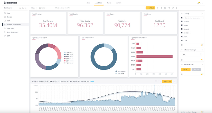
Sisense for Cloud Data Teams, formerly known as Periscope Data, is a data analytics software product that easily integrates with the Sisense platform and offers advanced analytics that provides actionable insights to teams that work with data in the cloud.
It gives consumers a unified interface via which they can save, arrange, analyze, and visualize all of their data to aid in improved decision-making.
It gives users of all types the ability to generate, consume, and share insights intuitively with one another, with or without coding experience.
Features of sisense.
1.Native Data Connectors: Using an ecosystem of native data connections and ETL partners, native data connectors combine data into a single, searchable database.
2.Cloud Data Pipelines: Control the timing and frequency of data refreshes as well as the appearance of the information flow using cloud data pipelines. A versatile, low-maintenance solution can let you get visibility and control over data pipelines.
3.Data Discovery: Directly access CSVs and data sets that analysts have carefully selected, and work with these insights using a drag-and-drop interface that doesn’t require SQL proficiency.
4.Git Integration: Give developers total control over their analytics environment with Git integration, comprehensive version control, release management workflows, and file-level access to any user-generated material, such as reports. Through Git, you may create, edit, sync, and delete all settings.
5.Model-as-You-Go: Create unique, on-the-fly data models to perform ad hoc analysis to quickly and easily answer important issues.
6.Visualization of data: Including scatter plots, bar charts, bubble charts, bullet charts, funnel charts, waterfall charts, control charts, Gantt charts, radial bar charts, and more, create and share sophisticated data visualizations that are extremely configurable.
7.Database Editor Tools: Using effective SQL writing tools like query revision history, views, filters, autocomplete recommendations, formatting, and more, you can reduce the time it takes to move from query to response.
8.Master SQL: Try using drag-and-drop fields to query data in the SQL programming language to watch how the results alter. Users who don’t know SQL well should be encouraged to learn it.
9.Code Library: Reduce repetitious data-entering duties and save up time for later report preparation with the help of the code library. Snippets are a convenient way to save and later retrieve commonly used code.
10Spaces: Manage data-level rights to the gate and restrict access to critical data and individually tailor dashboards.
11.Embed and Share: Share dashboards by integrating them into other web portals or web applications or by making password-protected public URLs available. For purposes like email dissemination, download dashboards as static PDF pictures.
Cons for Sisense.
1.Not very user-friendly is ElasticubeTM
Even though Sisense’s ElasticubeTM enables the software to instantly gather vast data sets, it is challenging to construct for the typical user and necessitates a high level of technical competence.
Even though Sisense advertises its “codeless reporting,” users frequently have to write SQL code.
However, there are some restrictions, such as join types and other things, that cause challenging workarounds, thus getting to this codeless reporting requires a very technical person to write the SQL to build ElasticubeTM.
Because the system depends on the cube, Sisense won’t function if the cube is down, and prior Sisense users have complained to us that they encountered numerous issues getting the ElasticubeTM to load.
2.Sisense is a “heavy” application.
This is a statement about the strength of the server, the quantity of storage and resources occupied by the program, as well as the length of time required for setup, configuration, and user acceptance.
3.The dashboards from Sisense are entirely web-based.
For users with real-time online access, the dashboard is excellent, but sharing a flattened, less feature-rich version that may be printed or embedded can be difficult.
Sisense does not provide robust email-deliverable scheduled reports that users can access outside of the online interface.
The inability to share a report or offline dashboard via PDF with users outside of the Sisense system has been brought up by Sisense users in complaints to us.
A few pricing and support red flags exist for Sisense.
5.LOOKER.
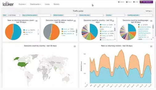
Businesses may explore, find, visualize, and share data insights using Looker, a web-based analytics service.
To better understand their business and KPIs, enterprises can drill down into data and view the data sources.
This solution assists in the definition of data associations without the use of SQL by using a straightforward proprietary modeling language. Regardless of technical skill levels, it supports data accessibility and literacy.
Features of Looker.
1.Automated modeling: By connecting to relational databases, models are created automatically from the database structure.
2.Intuitive Visualizations: Produces visualizations straight from the selected data source in real-time. Several other types of visualizations are available, including bar graphs, pie charts, Sankey diagrams, spider web diagrams, sunburst graphs, chord diagrams, heatmaps, funnels, treemaps, and many more.
3.Time Zone Handling: Regardless of the data’s origin time zone, it is easily incorporated into the representation.
4.LookML Data Modeling Language: Use this proprietary SQL-based data modeling language to build scalable, reusable data models.
5.Pre-Built Analytics Code: Start by constructing data analytics models with its Blocks feature’s programmable code blocks. Offers bespoke visualization choices, pre-built data models, and efficient SQL patterns, among other things.
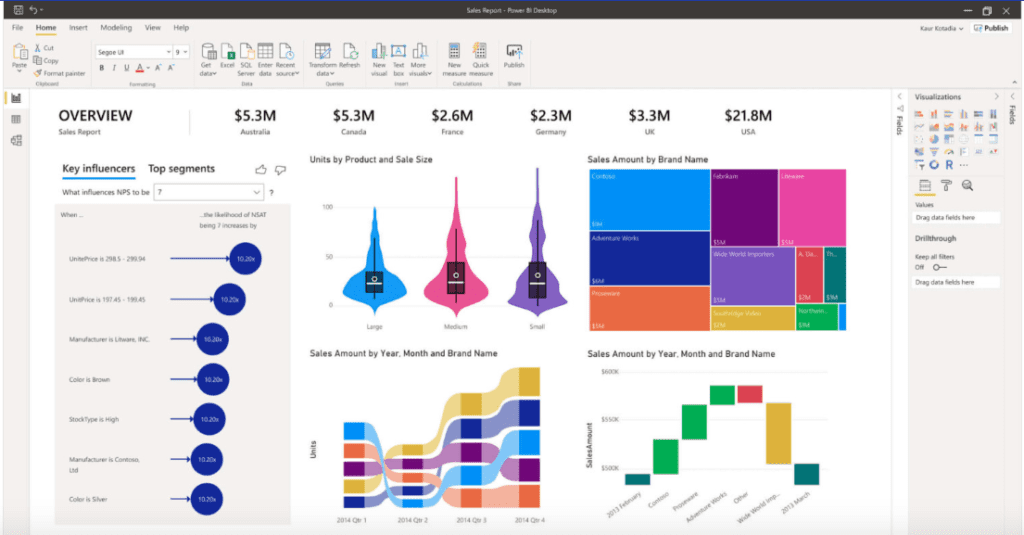
6.Microsoft power bi.
To deliver business insights, Microsoft Power BI is an analytics application that helps with reporting, data mining, and data visualization.
Businesses may connect to several data sources and design custom dashboards and reports using Power BI’s user-friendly interface.
Power BI began as an Excel add-on but has since developed into a standalone product. Power BI meets the requirements of businesses ranging from sole proprietors to large corporations at a reasonably affordable cost.
There are three versions: Desktop, which is free for personal use, an improved Pro plan available through a monthly SaaS subscription at a fixed price per user, and a capacity-based Premium plan that offers enterprise-level insights with on-premise deployment and dedicated cloud infrastructure.
Features of Microsoft Power BI.
1.Data Source Connectivity: Use hundreds of supported on-premises and cloud-based data sources, such as online APIs, Salesforce, Dynamics 365, Excel, Google Analytics, JSON and text/CSV files, Oracle, SQL, and more, to access data.
2.Data Preparation: To get ready for Power BI analysis, self-service Power Query processes collect, transform, integrate, and enrich data.
Unstructured data can be put into interpretable data sets to show trends. Utilize logical filters and data manipulation tools to approach analysis from various perspectives.
3.Data Visualization: Power BI produces a variety of data visualizations that conceptualize trends and patterns. Bar graphs, line graphs, pie charts, scattergrams, maps, and other types of graphics can be used for these. Power BI converts difficult-to-understand numbers and abstract ideas into visually appealing graphics.
4.Prebuilt or customized dashboards and reports: Select from a variety of pre-made templates that are tailored for the majority of sectors to quickly produce KPI visualizations. Alternatively, Power BI’s drag-and-drop canvas and hundreds of interactive visualization options can be used to create customized data stories if pre-packaged reports aren’t sufficient.
5.Interpreting natural language: Find insightful responses to queries about data using the built-in Q&A tool to explore data conversationally.
6.Managing secure data: Row-level security and role-specific data protection can help you avoid data loss. Ensures data security so that Power BI complies with industry-level compliance requirements and certifications.
Enables managers to consolidate data governance, security, and administration throughout the company.
7.Collaboration: Is fostered via Power BI’s data-driven business intelligence culture and tools like team commenting, notifications, and content subscriptions. Publicize and distribute dashboards and reports with customizable permissions both within and internationally.
8.Mobile Compatibility: Power BI reports may all be published to the cloud, on-premises, or incorporated into other apps or websites and are all mobile-friendly. From any mobile device running Android or iOS, or any PC, tablet, or phone with access to the Windows Store, you can instantly view and share insights, receive personal data alerts, and remain informed.
9.Embedded Analytics: White-label capabilities and a wide range of visualization options are available with embedded analytics, allowing you to brand and tailor unique custom analytics products for end customers. To integrate Power BI’s analytics capabilities into other programs, create and test your custom modules.
10.Seamless Integration: A variety of different software and BI solutions, as well as Power BI, are all easily integrated with the Microsoft Office 365 Suite. Third-party data sources like Spark, Google Analytics, and others are included in this.
11.On-Premises or Cloud Server: Power BI’s Report Server, included in the Premium subscription, offers a hybrid, all-encompassing solution by creating a BI environment on-premises and safeguarding it behind the intranet firewall. gives the option to relocate the server to the cloud when needed, safeguarding the company’s investment and data in the long run.
Cons for Microsoft Power bi.
- For services like Vend POS or Shopify, there is no direct integration available.
- In comparison to other BI tools, graphic visualization is quite constrained.
- SQL queries are not supported.
- Working with large data sets using Power BI can be challenging.
- Does not allow users to create customized reports, customized user views, tailored notifications, or personalized security views.
7.TABLEAU DESKTOP.
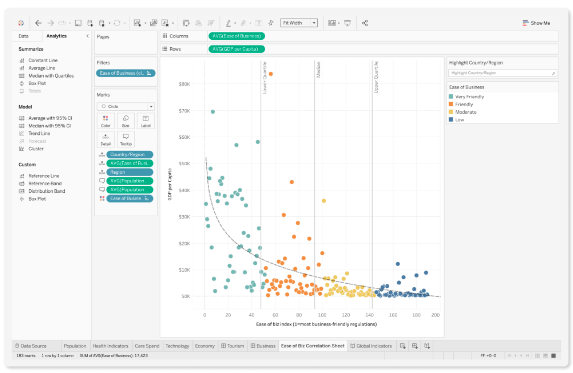
Tableau is a data analytics and visualization tool that helps businesses make data-driven choices.
It combines data from a variety of sources to offer timely, useful insights. No matter the user’s level of expertise, it enables data discovery with simple tools like drag-and-drop filtering and natural language queries.
It gives users control over data visualization and offers a wide range of customization and security options, allowing them to create dashboards and stories that successfully tell corporate narratives.
It is available as a component of the Tableau Creator bundle, which also includes the desktop version, Prep, and a Creator license for the server or online version.
Features of Tableau Desktop.
1.Drag and Drop Visualizations: Create reports easily and rapidly while exploring data trends, correlations, and analysis.
2.Augmented Data Preparation: Data cleaning, combining, and shaping using machine learning constitute enhanced data preparation. Automates self-service data preparation and minimizes manual data processing tasks.
3.Data Source Integrations: Several relational, semi-structured, and unstructured data sources can be used to gather information. Ready data connectors can connect to data from sources like Google Analytics, Salesforce, or Amazon Redshift that is on-premises, saved in a file or database server, or the cloud as soon as they are launched.
4.Real-Time Access: Automatically updates data from web applications and cloud databases and supports real-time data queries.
5.Interactive dashboards: Create data visualizations for responsive dashboards. Customize these dashboards to be interactive and draw attention to particular statistics by underlining the data. Give your coworkers or clients access to this data so they can examine it independently.
6.Interpreting natural language: Use its “Ask Data” function to quickly submit queries and interact with data; coding knowledge is not required. You can ask questions and receive immediate responses in the form of data visualizations.
7.Recommendations for Visualizations: Based on the data chosen for analysis, “Show Me” makes suggestions for various visualization styles. View a palette of all available visualization possibilities before limiting the sorts of visualizations that are available by selecting specific data to study and getting suggested visualizations.
8.Assign and manage permissions: Depending on roles view and comprehend insights with various levels of visibility.
9.Geographic Data Analysis: Discover the “where” and “why” of data by transforming geographical information into detailed interactive maps using the program’s built-in geographic capabilities.
10.Based on a user’s role: With varying visibility based on their function, Tableau users may view and comprehend insights.
11.Smart Analytics: Utilizes AI’s “Explain Data” function to provide a collection of explanations for particular data points using smart analytics. Suggests tables, joins, and sources by analyzing user behavior and patterns of data connectivity. Offers view recommendations that are in line with user preferences.
12.Time Series Analysis: Using its built-in date and time functions, you may drag and drop and drill down with a single click to examine time trends. Make long-term comparisons, such as growth from year to year or insights based on the days of the week.
13.Mobile App: Its mobile version is compatible with many of the features included in the desktop and web editions, such as interactive dashboards, filters, and drill-down options.
Cons for Tableau Desktop.
- There is no data encryption support in Tableau Server.
- Cannot recover specific client workbooks or data that was lost as a result of circumstances other than system failure.
- End users cannot enable or disable alerts; only site administrators have this ability.
- Predicts the future but does not permit consumers to alter the predictive analytics system.
- Provides no column-level security controls.
- Doesn’t support multiple locations.
- Integrations and other sophisticated tasks call for IT support. Tutorials and self-help videos cannot assist users to accomplish this on their own.
8.Zoho analytics.
With the use of a quick, simple, self-service architecture, users of Zoho Analytics (formerly known as Zoho Reports) may build visualizations and dashboards to display their data.
Through considerable automation efforts in multiple dimensions of the analytical process, it provides insight and analysis of business data for a company on-demand without requiring IT support or data analysts.
Users may process enormous datasets, clean and combine data, carry out numerous analytical activities, and then visualize the outcomes in dynamic visuals to gain insights.
In a stand-alone or embedded system that supports mobile devices, they can make business decisions based on data. Both on-premises and cloud deployment models are adaptable.
Features of Zoho Analytics.
1.Geo Visualization: Sales representatives may quickly and easily compare regional performance using interactive map charts thanks to geo-visualization. Comparative analysis can be done among nations, states, counties, and more.
2.Data Notifications: Managers can configure alert criteria that cause automated alerts to be sent out when there is a significant change or anomaly in the data.
3.Scheduling reports: publication or automatic emailing is possible. Recurring reports should also be scheduled to run regularly.
4.Drag-and-Drop Interface: Without the usage of code, generating relevant reports is quick and simple thanks to a drag-and-drop interface. To acquire insights, drill deeper into the data, view the underlying data, use contextual filters, and undertake data exploration.
5.White Labeling: To make it easier to embed the solution into websites or applications, the solution is white-labeled. You can insert specific reports or dashboards using this technology.
6.Query Zia: Zia is an intelligent analytical assistant made from a combination of machine learning and AI techniques. Natural query language (NQL) inquiries can be entered by staff members, and the assistant will respond with ideas and information via reports or by creating and sourcing KPI widgets automatically.
7.Input/Output Devices: connects to many different data connectors, such as files and feeds, cloud storage, several databases, CRM systems, Google Analytics, marketing platforms, social networking platforms, financial platforms, e-commerce platforms, HR, and more.
8.Data from Auto-Joined Tables: Tables connected by a Lookup column can be merged automatically by auto-joining tables (schemas attribute). Cohesive database construction is aided and somewhat automated by this.
9.Support for mobile devices: iOS and Android apps enable managers to examine reports and dashboards from their mobile devices and monitor operations from any location.
Cons for Zoho Analytic.
- For beginners, there is a significant learning curve.
- It is difficult to combine and join queries.
- Due to its extensive feature set, the user interface can be confusing.
9.KLIPFOLIO.
By creating dashboards and reports that measure KPIs and keep an eye on trends, Klipfolio is an analytics software solution that assists users in using data wisely and confidently.
This Data Visualization software for small business allow users can create dynamic data visualizations that they can easily share with others and gain insights from data that have been gathered conveniently from around the enterprise.
The four plans—publish; Grow, Team, and Team+—can be subscribed to on an annual or monthly basis. Depending on the chosen payment plan, there are limits on the number of dashboards and users that are permitted, as well as on the data refresh rate and level of support.
Features of Klipfolio.
1.Data Connectivity: With thousands of different data sources and hundreds of built-in data connectors, you can access data from many of the most popular data points.
Make your custom queries using open web services to connect to even more different types of data. Alternatively, you can access SQL databases by manually uploading files and setting up FTP server connections.
2.Perspective on social media: To analyze and present brand performance on social media sites like LinkedIn, Twitter, Facebook, and others, combine social media data with other confidential business information.
3.Automated Data Retrieval: Automatically update visuals from a variety of data sources when it detects a change in the users’ data. By default, updates every 30 minutes, however, some subscription plans allow for faster updates.
4.Data Merging: Data merging is the process of combining information from several data sources to produce insights that track desired KPIs and provide a more comprehensive picture of business performance.
5.Power Metrics Data History: Make use of Power Metrics to track and store multi-dimensional data points for metrics and to deliver ongoing insights into both current and past data, even for data services that don’t provide history, such as social media feeds. By contrasting eras, discover historical tendencies.
6.Data Visualizations: Select 15 different categories of custom visualizations to increase the visual impact of a dashboard.
7.Service Interactivity for Self: Filter and segment data by individual dimensions or change date ranges to go deeper into dashboards. Automatic trend lines and applied operations like grouping, filtering, aggregating, and sorting let you add context to findings.
8.Pre-made and Adaptable Dashboards: Choose a pre-built dashboard from a variety of template options to quickly create one, or design a unique one.
9.Targets and metrics: Keep track of metrics with notifications and indicators that alert you to trends, potential problems, and successes as they exceed or fall below conditional pre-set thresholds.
10.Sharing: Share dashboards and visualizations with just one click, and download them as photos or PDFs to post on social media or send via messaging services.
Create a timetable for the distribution of reports to a selected group of members regularly. Display dashboards on TVs, incorporate them into websites or other apps or make them publicly accessible with individually generated URLs.
11.Search Function: Use the natural query language (NQL) search function to look for data points, visualizations, or dashboards in a manner akin to how one could use Google or other search engines.
Klipfolio Dislikes.
- Light and dark color schemes are the only ones available for data visualization.
- Some programming experience is needed to create charts.
- A steep learning curve, especially when it comes to formula and function syntax.
- After data refresh and filtering, loading is slow.
- The periodic refresh feature for data metrics has an additional cost over and above the subscription plan.
Summary.
With the above Data Visualization software for small business, you will get the appropriate view of your business performance metrics.The above software have been tested and used by many.All you need is to read their features and select the one that suites you.Wish you all the best.